
3
More Annotations

6


3
Favourite Annotations


3


1
Text
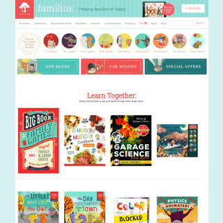
LEARNVEST | MAKE PROGRESS ON YOUR MONEY Thank you for coming to our site and letting us serve as a resource to you as you make progress on your money. Your financial journey is important to us, so we encourage you to visit Northwestern Mutual's Life & Money page. There, you'll find articles on everything from creating a budget to saving for your future so you can navigate life's
STYLE GUIDE
Navigation. While some navigation components are sure to be application-specific, the UI-Toolkit provides a suite of common navigation components that should hopefully form the backbone for your application's navigation paradigms.. Below, we provide discussions and demonstrations of each of these individual components, as well as an example of how they can work together in context.STYLE GUIDE
Basics. Start by adding an element with a class of .row.This will create a horizontal block to contain vertical columns. Next, add the .columns class to a child element of that row. If you only add the .columns class, that column will span the entire width of the containing .row.. Specify the widths of each column with the .small-#, .medium-#, .large-# and .xlarge-# classes, whereSTYLE GUIDE
Example Modal. Lorem ipsum dolor sit amet, consectetur adipisicing elit, sed do eiusmodtempor incididunt ut labore et dolore magna aliqua. Ut enim ad minim veniam,quis nostrud exercitation ullamco laboris nisi ut aliquip ex ea commodoconsequat.STYLE GUIDE
Example Modal. Lorem ipsum dolor sit amet, consectetur adipisicing elit, sed do eiusmodtempor incididunt ut labore et dolore magna aliqua. Ut enim ad minim veniam,quis nostrud exercitation ullamco laboris nisi ut aliquip ex ea commodoconsequat.STYLE GUIDE
Navigation. While some navigation components are sure to be application-specific, the UI-Toolkit provides a suite of common navigation components that should hopefully form the backbone for your application's navigation paradigms.. Below, we provide discussions and demonstrations of each of these individual components, as well as an example of how they can work together in context.STYLE GUIDE
Tooltip Positions. Tooltips can be positioned in a number of ways, each of which is a corresonding class. This class is always constructed in the pattern .tooltip--.. The example above uses the class .tooltip-right-top, and as a result, the .tooltip component is displayed on the right of its target, and aligned to thetarget's top side.
STYLE GUIDE
Icons. All icons need to be used in partnership with a product designer so we can ensure consistency of use throughout the NM experience. The icons in the UI-Toolkit are automatically generated from SVG files. These files are packaged up into a font that is then served directly to the browser via the UI-Toolkit CSS.. To render an icon, simply use the .icon class, along with the the class forSTYLE GUIDE
Example Modal. Lorem ipsum dolor sit amet, consectetur adipisicing elit, sed do eiusmodtempor incididunt ut labore et dolore magna aliqua. Ut enim ad minim veniam,quis nostrud exercitation ullamco laboris nisi ut aliquip ex ea commodoconsequat.STYLE GUIDE
Example Modal. Lorem ipsum dolor sit amet, consectetur adipisicing elit, sed do eiusmodtempor incididunt ut labore et dolore magna aliqua. Ut enim ad minim veniam,quis nostrud exercitation ullamco laboris nisi ut aliquip ex ea commodoconsequat. LEARNVEST | MAKE PROGRESS ON YOUR MONEY Thank you for coming to our site and letting us serve as a resource to you as you make progress on your money. Your financial journey is important to us, so we encourage you to visit Northwestern Mutual's Life & Money page. There, you'll find articles on everything from creating a budget to saving for your future so you can navigate life'sSTYLE GUIDE
Navigation. While some navigation components are sure to be application-specific, the UI-Toolkit provides a suite of common navigation components that should hopefully form the backbone for your application's navigation paradigms.. Below, we provide discussions and demonstrations of each of these individual components, as well as an example of how they can work together in context.STYLE GUIDE
Basics. Start by adding an element with a class of .row.This will create a horizontal block to contain vertical columns. Next, add the .columns class to a child element of that row. If you only add the .columns class, that column will span the entire width of the containing .row.. Specify the widths of each column with the .small-#, .medium-#, .large-# and .xlarge-# classes, whereSTYLE GUIDE
Example Modal. Lorem ipsum dolor sit amet, consectetur adipisicing elit, sed do eiusmodtempor incididunt ut labore et dolore magna aliqua. Ut enim ad minim veniam,quis nostrud exercitation ullamco laboris nisi ut aliquip ex ea commodoconsequat.STYLE GUIDE
Example Modal. Lorem ipsum dolor sit amet, consectetur adipisicing elit, sed do eiusmodtempor incididunt ut labore et dolore magna aliqua. Ut enim ad minim veniam,quis nostrud exercitation ullamco laboris nisi ut aliquip ex ea commodoconsequat.STYLE GUIDE
Navigation. While some navigation components are sure to be application-specific, the UI-Toolkit provides a suite of common navigation components that should hopefully form the backbone for your application's navigation paradigms.. Below, we provide discussions and demonstrations of each of these individual components, as well as an example of how they can work together in context.STYLE GUIDE
Tooltip Positions. Tooltips can be positioned in a number of ways, each of which is a corresonding class. This class is always constructed in the pattern .tooltip--.. The example above uses the class .tooltip-right-top, and as a result, the .tooltip component is displayed on the right of its target, and aligned to thetarget's top side.
STYLE GUIDE
Icons. All icons need to be used in partnership with a product designer so we can ensure consistency of use throughout the NM experience. The icons in the UI-Toolkit are automatically generated from SVG files. These files are packaged up into a font that is then served directly to the browser via the UI-Toolkit CSS.. To render an icon, simply use the .icon class, along with the the class forSTYLE GUIDE
Example Modal. Lorem ipsum dolor sit amet, consectetur adipisicing elit, sed do eiusmodtempor incididunt ut labore et dolore magna aliqua. Ut enim ad minim veniam,quis nostrud exercitation ullamco laboris nisi ut aliquip ex ea commodoconsequat.STYLE GUIDE
Example Modal. Lorem ipsum dolor sit amet, consectetur adipisicing elit, sed do eiusmodtempor incididunt ut labore et dolore magna aliqua. Ut enim ad minim veniam,quis nostrud exercitation ullamco laboris nisi ut aliquip ex ea commodoconsequat.STYLE GUIDE
To use the font styles/sizes found here, add the class .nm-cx-theme to the container of your body or section.. As of UITK version 1.14.0, only one font is to be used site-wide as per the Design department.Guardian Sans is the one font to rule them all. As of UITK version 1.17.0, only 3 font weights (plus 1 for print) are to be used site-wide as per the Design department.STYLE GUIDE
Print Visibility. The UITK includes a couple of simple classes you can use to control elements printing, or not printing. Simply attach .show-for-print to an element to show when printing, .print-only for showing the element only when printing, and .hide-for-print to hide something when printing.. Important: Grid classes can be used to style print media, just be sure to use the .small-# gridSTYLE GUIDE
Example Modal. Lorem ipsum dolor sit amet, consectetur adipisicing elit, sed do eiusmodtempor incididunt ut labore et dolore magna aliqua. Ut enim ad minim veniam,quis nostrud exercitation ullamco laboris nisi ut aliquip ex ea commodoconsequat.STYLE GUIDE
Sub-Table Accordions. The .sub-table-accordion class may be added the the preceeding sibling of the sub-table that you'd like to collapse/expand. This will append the icon in the last table row. At the same time, you will want to add .sub-table-hide in order to have the sub-table collapsed on page load. You will need use the .sub-table-hide class to toggle on and off in order to showSTYLE GUIDE
Grid. Create powerful multi-device layouts quickly and easily with the default 12-column, nest-able Foundation grid. If you're familiar with grid systems, you'll feel right at home.STYLE GUIDE
LV Modals. To use a modal, three components will need to be available in the DOM: A .modal-overlay, used to obscure content currently visible.; A .modal-container, used to house the modal and corresponding close-button.; A .page-container, used to house all non-modal related content in the DOM.; These components are demonstrated by the example HTML below.STYLE GUIDE
Prefix-Postfix Labels & Actions. Below is an example of serving a label alongside a text-input. This is achieved by using the .prefix class on the label to denote its position relative to the input it is labeling. Note that the input itself also has the .with-prefix class. In addition, the label and the input are displayed within a Foundation sub-grid, used to determine the size of the labelSTYLE GUIDE
The two elements within the markup of which users should take note are the .tooltip and the .tooltip-target.The .tooltip-target will allow the .tooltip to be positioned accordingly to the element it is placed on.. In the following notes, we will discuss the ways in which theSTYLE GUIDE
Notification Banners - Standalone. The standalone notification banner is meant to, well, stand alone. It can be injected in dialogs or modals or appear at the top of a dashboard, and is meant to prominently inform the user of important information.STYLE GUIDE
Basic. You can create a button group as follows. NOTE: NM should use both .button-group and .btn-cta classes when adding new buttons groups to get the most recent design styles. Legacy styles are still available by using just the .button-group class. LV can leave out the btn-cta since those styles are not currently available for LV. LEARNVEST | MAKE PROGRESS ON YOUR MONEY Thank you for coming to our site and letting us serve as a resource to you as you make progress on your money. Your financial journey is important to us, so we encourage you to visit Northwestern Mutual's Life & Money page. There, you'll find articles on everything from creating a budget to saving for your future so you can navigate life'sSTYLE GUIDE
Example Modal. Lorem ipsum dolor sit amet, consectetur adipisicing elit, sed do eiusmodtempor incididunt ut labore et dolore magna aliqua. Ut enim ad minim veniam,quis nostrud exercitation ullamco laboris nisi ut aliquip ex ea commodoconsequat.STYLE GUIDE
To use the font styles/sizes found here, add the class .nm-cx-theme to the container of your body or section.. As of UITK version 1.14.0, only one font is to be used site-wide as per the Design department.Guardian Sans is the one font to rule them all. As of UITK version 1.17.0, only 3 font weights (plus 1 for print) are to be used site-wide as per the Design department.STYLE GUIDE
Print Visibility. The UITK includes a couple of simple classes you can use to control elements printing, or not printing. Simply attach .show-for-print to an element to show when printing, .print-only for showing the element only when printing, and .hide-for-print to hide something when printing.. Important: Grid classes can be used to style print media, just be sure to use the .small-# gridSTYLE GUIDE
Navigation. While some navigation components are sure to be application-specific, the UI-Toolkit provides a suite of common navigation components that should hopefully form the backbone for your application's navigation paradigms.. Below, we provide discussions and demonstrations of each of these individual components, as well as an example of how they can work together in context.STYLE GUIDE
LV Modals. To use a modal, three components will need to be available in the DOM: A .modal-overlay, used to obscure content currently visible.; A .modal-container, used to house the modal and corresponding close-button.; A .page-container, used to house all non-modal related content in the DOM.; These components are demonstrated by the example HTML below.STYLE GUIDE
Example Modal. Lorem ipsum dolor sit amet, consectetur adipisicing elit, sed do eiusmodtempor incididunt ut labore et dolore magna aliqua. Ut enim ad minim veniam,quis nostrud exercitation ullamco laboris nisi ut aliquip ex ea commodoconsequat.STYLE GUIDE
Example Modal. Lorem ipsum dolor sit amet, consectetur adipisicing elit, sed do eiusmodtempor incididunt ut labore et dolore magna aliqua. Ut enim ad minim veniam,quis nostrud exercitation ullamco laboris nisi ut aliquip ex ea commodoconsequat.STYLE GUIDE
Notification Banners - Standalone. The standalone notification banner is meant to, well, stand alone. It can be injected in dialogs or modals or appear at the top of a dashboard, and is meant to prominently inform the user of important information.STYLE GUIDE
Typography. The typography in this style-guide is meant to make your life easier by providing clean, attractive, simple default styles for all of the most basic typographical elements. LEARNVEST | MAKE PROGRESS ON YOUR MONEY Thank you for coming to our site and letting us serve as a resource to you as you make progress on your money. Your financial journey is important to us, so we encourage you to visit Northwestern Mutual's Life & Money page. There, you'll find articles on everything from creating a budget to saving for your future so you can navigate life'sSTYLE GUIDE
Example Modal. Lorem ipsum dolor sit amet, consectetur adipisicing elit, sed do eiusmodtempor incididunt ut labore et dolore magna aliqua. Ut enim ad minim veniam,quis nostrud exercitation ullamco laboris nisi ut aliquip ex ea commodoconsequat.STYLE GUIDE
To use the font styles/sizes found here, add the class .nm-cx-theme to the container of your body or section.. As of UITK version 1.14.0, only one font is to be used site-wide as per the Design department.Guardian Sans is the one font to rule them all. As of UITK version 1.17.0, only 3 font weights (plus 1 for print) are to be used site-wide as per the Design department.STYLE GUIDE
Print Visibility. The UITK includes a couple of simple classes you can use to control elements printing, or not printing. Simply attach .show-for-print to an element to show when printing, .print-only for showing the element only when printing, and .hide-for-print to hide something when printing.. Important: Grid classes can be used to style print media, just be sure to use the .small-# gridSTYLE GUIDE
Navigation. While some navigation components are sure to be application-specific, the UI-Toolkit provides a suite of common navigation components that should hopefully form the backbone for your application's navigation paradigms.. Below, we provide discussions and demonstrations of each of these individual components, as well as an example of how they can work together in context.STYLE GUIDE
LV Modals. To use a modal, three components will need to be available in the DOM: A .modal-overlay, used to obscure content currently visible.; A .modal-container, used to house the modal and corresponding close-button.; A .page-container, used to house all non-modal related content in the DOM.; These components are demonstrated by the example HTML below.STYLE GUIDE
Example Modal. Lorem ipsum dolor sit amet, consectetur adipisicing elit, sed do eiusmodtempor incididunt ut labore et dolore magna aliqua. Ut enim ad minim veniam,quis nostrud exercitation ullamco laboris nisi ut aliquip ex ea commodoconsequat.STYLE GUIDE
Example Modal. Lorem ipsum dolor sit amet, consectetur adipisicing elit, sed do eiusmodtempor incididunt ut labore et dolore magna aliqua. Ut enim ad minim veniam,quis nostrud exercitation ullamco laboris nisi ut aliquip ex ea commodoconsequat.STYLE GUIDE
Notification Banners - Standalone. The standalone notification banner is meant to, well, stand alone. It can be injected in dialogs or modals or appear at the top of a dashboard, and is meant to prominently inform the user of important information.STYLE GUIDE
Typography. The typography in this style-guide is meant to make your life easier by providing clean, attractive, simple default styles for all of the most basic typographical elements.STYLE GUIDE
To use the font styles/sizes found here, add the class .nm-cx-theme to the container of your body or section.. As of UITK version 1.14.0, only one font is to be used site-wide as per the Design department.Guardian Sans is the one font to rule them all. As of UITK version 1.17.0, only 3 font weights (plus 1 for print) are to be used site-wide as per the Design department.STYLE GUIDE
Basics. Start by adding an element with a class of .row.This will create a horizontal block to contain vertical columns. Next, add the .columns class to a child element of that row. If you only add the .columns class, that column will span the entire width of the containing .row.. Specify the widths of each column with the .small-#, .medium-#, .large-# and .xlarge-# classes, whereSTYLE GUIDE
Example Modal. Lorem ipsum dolor sit amet, consectetur adipisicing elit, sed do eiusmodtempor incididunt ut labore et dolore magna aliqua. Ut enim ad minim veniam,quis nostrud exercitation ullamco laboris nisi ut aliquip ex ea commodoconsequat.STYLE GUIDE
Tooltip Positions. Tooltips can be positioned in a number of ways, each of which is a corresonding class. This class is always constructed in the pattern .tooltip--.. The example above uses the class .tooltip-right-top, and as a result, the .tooltip component is displayed on the right of its target, and aligned to thetarget's top side.
STYLE GUIDE
Sub-Table Accordions. The .sub-table-accordion class may be added the the preceeding sibling of the sub-table that you'd like to collapse/expand. This will append the icon in the last table row. At the same time, you will want to add .sub-table-hide in order to have the sub-table collapsed on page load. You will need use the .sub-table-hide class to toggle on and off in order to showSTYLE GUIDE
Icons. All icons need to be used in partnership with a product designer so we can ensure consistency of use throughout the NM experience. The icons in the UI-Toolkit are automatically generated from SVG files. These files are packaged up into a font that is then served directly to the browser via the UI-Toolkit CSS.. To render an icon, simply use the .icon class, along with the the class forSTYLE GUIDE
Prefix-Postfix Labels & Actions. Below is an example of serving a label alongside a text-input. This is achieved by using the .prefix class on the label to denote its position relative to the input it is labeling. Note that the input itself also has the .with-prefix class. In addition, the label and the input are displayed within a Foundation sub-grid, used to determine the size of the labelSTYLE GUIDE
The two elements within the markup of which users should take note are the .tooltip and the .tooltip-target.The .tooltip-target will allow the .tooltip to be positioned accordingly to the element it is placed on.. In the following notes, we will discuss the ways in which theSTYLE GUIDE
Typography. The typography in this style-guide is meant to make your life easier by providing clean, attractive, simple default styles for all of the most basic typographical elements.STYLE GUIDE
Forms. A combination of form styles and the Foundation grid means you can do almost anything. Listed below are styles for individual form components as well as various layout guidelines. LEARNVEST | MAKE PROGRESS ON YOUR MONEY Your financial journey is important to us, so we encourage you to visit Northwestern Mutual's Life & Money page. There, you'll find articles on everything from creating a budget to saving for your future so you can navigate life's moments, big and small.STYLE GUIDE
Basics. Start by adding an element with a class of .row.This will create a horizontal block to contain vertical columns. Next, add the .columns class to a child element of that row. If you only add the .columns class, that column will span the entire width of the containing .row.. Specify the widths of each column with the .small-#, .medium-#, .large-# and .xlarge-# classes, whereSTYLE GUIDE
To use the font styles/sizes found here, add the class .nm-cx-theme to the container of your body or section.. As of UITK version 1.14.0, only one font is to be used site-wide as per the Design department.Guardian Sans is the one font to rule them all. As of UITK version 1.17.0, only 3 font weights (plus 1 for print) are to be used site-wide as per the Design department.STYLE GUIDE
Print Visibility. The UITK includes a couple of simple classes you can use to control elements printing, or not printing. Simply attach .show-for-print to an element to show when printing, .print-only for showing the element only when printing, and .hide-for-print to hide something when printing.. Important: Grid classes can be used to style print media, just be sure to use the .small-# gridSTYLE GUIDE
Tooltip Positions. Tooltips can be positioned in a number of ways, each of which is a corresonding class. This class is always constructed in the pattern .tooltip--.. The example above uses the class .tooltip-right-top, and as a result, the .tooltip component is displayed on the right of its target, and aligned to thetarget's top side.
STYLE GUIDE
Navigation. While some navigation components are sure to be application-specific, the UI-Toolkit provides a suite of common navigation components that should hopefully form the backbone for your application's navigation paradigms.. Below, we provide discussions and demonstrations of each of these individual components, as well as an example of how they can work together in context.STYLE GUIDE
Sub-Table Accordions. The .sub-table-accordion class may be added the the preceeding sibling of the sub-table that you'd like to collapse/expand. This will append the icon in the last table row. At the same time, you will want to add .sub-table-hide in order to have the sub-table collapsed on page load. You will need use the .sub-table-hide class to toggle on and off in order to showSTYLE GUIDE
The two elements within the markup of which users should take note are the .tooltip and the .tooltip-target.The .tooltip-target will allow the .tooltip to be positioned accordingly to the element it is placed on.. In the following notes, we will discuss the ways in which theSTYLE GUIDE
Notification Banners - Standalone. The standalone notification banner is meant to, well, stand alone. It can be injected in dialogs or modals or appear at the top of a dashboard, and is meant to prominently inform the user of important information.STYLE GUIDE
Example Modal. Lorem ipsum dolor sit amet, consectetur adipisicing elit, sed do eiusmodtempor incididunt ut labore et dolore magna aliqua. Ut enim ad minim veniam,quis nostrud exercitation ullamco laboris nisi ut aliquip ex ea commodoconsequat. LEARNVEST | MAKE PROGRESS ON YOUR MONEY Your financial journey is important to us, so we encourage you to visit Northwestern Mutual's Life & Money page. There, you'll find articles on everything from creating a budget to saving for your future so you can navigate life's moments, big and small.STYLE GUIDE
Basics. Start by adding an element with a class of .row.This will create a horizontal block to contain vertical columns. Next, add the .columns class to a child element of that row. If you only add the .columns class, that column will span the entire width of the containing .row.. Specify the widths of each column with the .small-#, .medium-#, .large-# and .xlarge-# classes, whereSTYLE GUIDE
To use the font styles/sizes found here, add the class .nm-cx-theme to the container of your body or section.. As of UITK version 1.14.0, only one font is to be used site-wide as per the Design department.Guardian Sans is the one font to rule them all. As of UITK version 1.17.0, only 3 font weights (plus 1 for print) are to be used site-wide as per the Design department.STYLE GUIDE
Print Visibility. The UITK includes a couple of simple classes you can use to control elements printing, or not printing. Simply attach .show-for-print to an element to show when printing, .print-only for showing the element only when printing, and .hide-for-print to hide something when printing.. Important: Grid classes can be used to style print media, just be sure to use the .small-# gridSTYLE GUIDE
Tooltip Positions. Tooltips can be positioned in a number of ways, each of which is a corresonding class. This class is always constructed in the pattern .tooltip--.. The example above uses the class .tooltip-right-top, and as a result, the .tooltip component is displayed on the right of its target, and aligned to thetarget's top side.
STYLE GUIDE
Navigation. While some navigation components are sure to be application-specific, the UI-Toolkit provides a suite of common navigation components that should hopefully form the backbone for your application's navigation paradigms.. Below, we provide discussions and demonstrations of each of these individual components, as well as an example of how they can work together in context.STYLE GUIDE
Sub-Table Accordions. The .sub-table-accordion class may be added the the preceeding sibling of the sub-table that you'd like to collapse/expand. This will append the icon in the last table row. At the same time, you will want to add .sub-table-hide in order to have the sub-table collapsed on page load. You will need use the .sub-table-hide class to toggle on and off in order to showSTYLE GUIDE
The two elements within the markup of which users should take note are the .tooltip and the .tooltip-target.The .tooltip-target will allow the .tooltip to be positioned accordingly to the element it is placed on.. In the following notes, we will discuss the ways in which theSTYLE GUIDE
Notification Banners - Standalone. The standalone notification banner is meant to, well, stand alone. It can be injected in dialogs or modals or appear at the top of a dashboard, and is meant to prominently inform the user of important information.STYLE GUIDE
Example Modal. Lorem ipsum dolor sit amet, consectetur adipisicing elit, sed do eiusmodtempor incididunt ut labore et dolore magna aliqua. Ut enim ad minim veniam,quis nostrud exercitation ullamco laboris nisi ut aliquip ex ea commodoconsequat.STYLE GUIDE
To use the font styles/sizes found here, add the class .nm-cx-theme to the container of your body or section.. As of UITK version 1.14.0, only one font is to be used site-wide as per the Design department.Guardian Sans is the one font to rule them all. As of UITK version 1.17.0, only 3 font weights (plus 1 for print) are to be used site-wide as per the Design department.STYLE GUIDE
Example Modal. Lorem ipsum dolor sit amet, consectetur adipisicing elit, sed do eiusmodtempor incididunt ut labore et dolore magna aliqua. Ut enim ad minim veniam,quis nostrud exercitation ullamco laboris nisi ut aliquip ex ea commodoconsequat.STYLE GUIDE
Navigation. While some navigation components are sure to be application-specific, the UI-Toolkit provides a suite of common navigation components that should hopefully form the backbone for your application's navigation paradigms.. Below, we provide discussions and demonstrations of each of these individual components, as well as an example of how they can work together in context.STYLE GUIDE
Note that button styles are attached either to elements with the or to elements containing the .button class, and as such, these styles can be applied to any element.. It is recommended that these styles are only applied to elements with the or tags.STYLE GUIDE
Basic Button. You can create a button using minimal markup. NOTE: NM should use both .button and .btn-cta classes when adding new buttons to get the most recent design styles. Legacy styles are still available by using just the .button class. LV can leave out theSTYLE GUIDE
Icons. All icons need to be used in partnership with a product designer so we can ensure consistency of use throughout the NM experience. The icons in the UI-Toolkit are automatically generated from SVG files. These files are packaged up into a font that is then served directly to the browser via the UI-Toolkit CSS.. To render an icon, simply use the .icon class, along with the the class forSTYLE GUIDE
Prefix-Postfix Labels & Actions. Below is an example of serving a label alongside a text-input. This is achieved by using the .prefix class on the label to denote its position relative to the input it is labeling. Note that the input itself also has the .with-prefix class. In addition, the label and the input are displayed within a Foundation sub-grid, used to determine the size of the labelSTYLE GUIDE
Class Description; today: Add this class to the tick representing the current month or time. active: Add this class to the tick onmouseover/hover.
STYLE GUIDE
Example Modal. Lorem ipsum dolor sit amet, consectetur adipisicing elit, sed do eiusmodtempor incididunt ut labore et dolore magna aliqua. Ut enim ad minim veniam,quis nostrud exercitation ullamco laboris nisi ut aliquip ex ea commodoconsequat.STYLE GUIDE
Notification Banners - Standalone. The standalone notification banner is meant to, well, stand alone. It can be injected in dialogs or modals or appear at the top of a dashboard, and is meant to prominently inform the user of important information. LEARNVEST | MAKE PROGRESS ON YOUR MONEY Your financial journey is important to us, so we encourage you to visit Northwestern Mutual's Life & Money page. There, you'll find articles on everything from creating a budget to saving for your future so you can navigate life's moments, big and small.STYLE GUIDE
Basics. Start by adding an element with a class of .row.This will create a horizontal block to contain vertical columns. Next, add the .columns class to a child element of that row. If you only add the .columns class, that column will span the entire width of the containing .row.. Specify the widths of each column with the .small-#, .medium-#, .large-# and .xlarge-# classes, whereSTYLE GUIDE
To use the font styles/sizes found here, add the class .nm-cx-theme to the container of your body or section.. As of UITK version 1.14.0, only one font is to be used site-wide as per the Design department.Guardian Sans is the one font to rule them all. As of UITK version 1.17.0, only 3 font weights (plus 1 for print) are to be used site-wide as per the Design department.STYLE GUIDE
Print Visibility. The UITK includes a couple of simple classes you can use to control elements printing, or not printing. Simply attach .show-for-print to an element to show when printing, .print-only for showing the element only when printing, and .hide-for-print to hide something when printing.. Important: Grid classes can be used to style print media, just be sure to use the .small-# gridSTYLE GUIDE
Tooltip Positions. Tooltips can be positioned in a number of ways, each of which is a corresonding class. This class is always constructed in the pattern .tooltip--.. The example above uses the class .tooltip-right-top, and as a result, the .tooltip component is displayed on the right of its target, and aligned to thetarget's top side.
STYLE GUIDE
Navigation. While some navigation components are sure to be application-specific, the UI-Toolkit provides a suite of common navigation components that should hopefully form the backbone for your application's navigation paradigms.. Below, we provide discussions and demonstrations of each of these individual components, as well as an example of how they can work together in context.STYLE GUIDE
Sub-Table Accordions. The .sub-table-accordion class may be added the the preceeding sibling of the sub-table that you'd like to collapse/expand. This will append the icon in the last table row. At the same time, you will want to add .sub-table-hide in order to have the sub-table collapsed on page load. You will need use the .sub-table-hide class to toggle on and off in order to showSTYLE GUIDE
The two elements within the markup of which users should take note are the .tooltip and the .tooltip-target.The .tooltip-target will allow the .tooltip to be positioned accordingly to the element it is placed on.. In the following notes, we will discuss the ways in which theSTYLE GUIDE
Notification Banners - Standalone. The standalone notification banner is meant to, well, stand alone. It can be injected in dialogs or modals or appear at the top of a dashboard, and is meant to prominently inform the user of important information.STYLE GUIDE
Example Modal. Lorem ipsum dolor sit amet, consectetur adipisicing elit, sed do eiusmodtempor incididunt ut labore et dolore magna aliqua. Ut enim ad minim veniam,quis nostrud exercitation ullamco laboris nisi ut aliquip ex ea commodoconsequat. LEARNVEST | MAKE PROGRESS ON YOUR MONEY Your financial journey is important to us, so we encourage you to visit Northwestern Mutual's Life & Money page. There, you'll find articles on everything from creating a budget to saving for your future so you can navigate life's moments, big and small.STYLE GUIDE
Basics. Start by adding an element with a class of .row.This will create a horizontal block to contain vertical columns. Next, add the .columns class to a child element of that row. If you only add the .columns class, that column will span the entire width of the containing .row.. Specify the widths of each column with the .small-#, .medium-#, .large-# and .xlarge-# classes, whereSTYLE GUIDE
To use the font styles/sizes found here, add the class .nm-cx-theme to the container of your body or section.. As of UITK version 1.14.0, only one font is to be used site-wide as per the Design department.Guardian Sans is the one font to rule them all. As of UITK version 1.17.0, only 3 font weights (plus 1 for print) are to be used site-wide as per the Design department.STYLE GUIDE
Print Visibility. The UITK includes a couple of simple classes you can use to control elements printing, or not printing. Simply attach .show-for-print to an element to show when printing, .print-only for showing the element only when printing, and .hide-for-print to hide something when printing.. Important: Grid classes can be used to style print media, just be sure to use the .small-# gridSTYLE GUIDE
Tooltip Positions. Tooltips can be positioned in a number of ways, each of which is a corresonding class. This class is always constructed in the pattern .tooltip--.. The example above uses the class .tooltip-right-top, and as a result, the .tooltip component is displayed on the right of its target, and aligned to thetarget's top side.
STYLE GUIDE
Navigation. While some navigation components are sure to be application-specific, the UI-Toolkit provides a suite of common navigation components that should hopefully form the backbone for your application's navigation paradigms.. Below, we provide discussions and demonstrations of each of these individual components, as well as an example of how they can work together in context.STYLE GUIDE
Sub-Table Accordions. The .sub-table-accordion class may be added the the preceeding sibling of the sub-table that you'd like to collapse/expand. This will append the icon in the last table row. At the same time, you will want to add .sub-table-hide in order to have the sub-table collapsed on page load. You will need use the .sub-table-hide class to toggle on and off in order to showSTYLE GUIDE
The two elements within the markup of which users should take note are the .tooltip and the .tooltip-target.The .tooltip-target will allow the .tooltip to be positioned accordingly to the element it is placed on.. In the following notes, we will discuss the ways in which theSTYLE GUIDE
Notification Banners - Standalone. The standalone notification banner is meant to, well, stand alone. It can be injected in dialogs or modals or appear at the top of a dashboard, and is meant to prominently inform the user of important information.STYLE GUIDE
Example Modal. Lorem ipsum dolor sit amet, consectetur adipisicing elit, sed do eiusmodtempor incididunt ut labore et dolore magna aliqua. Ut enim ad minim veniam,quis nostrud exercitation ullamco laboris nisi ut aliquip ex ea commodoconsequat.STYLE GUIDE
To use the font styles/sizes found here, add the class .nm-cx-theme to the container of your body or section.. As of UITK version 1.14.0, only one font is to be used site-wide as per the Design department.Guardian Sans is the one font to rule them all. As of UITK version 1.17.0, only 3 font weights (plus 1 for print) are to be used site-wide as per the Design department.STYLE GUIDE
Example Modal. Lorem ipsum dolor sit amet, consectetur adipisicing elit, sed do eiusmodtempor incididunt ut labore et dolore magna aliqua. Ut enim ad minim veniam,quis nostrud exercitation ullamco laboris nisi ut aliquip ex ea commodoconsequat.STYLE GUIDE
Navigation. While some navigation components are sure to be application-specific, the UI-Toolkit provides a suite of common navigation components that should hopefully form the backbone for your application's navigation paradigms.. Below, we provide discussions and demonstrations of each of these individual components, as well as an example of how they can work together in context.STYLE GUIDE
Note that button styles are attached either to elements with the or to elements containing the .button class, and as such, these styles can be applied to any element.. It is recommended that these styles are only applied to elements with the or tags.STYLE GUIDE
Basic Button. You can create a button using minimal markup. NOTE: NM should use both .button and .btn-cta classes when adding new buttons to get the most recent design styles. Legacy styles are still available by using just the .button class. LV can leave out theSTYLE GUIDE
Icons. All icons need to be used in partnership with a product designer so we can ensure consistency of use throughout the NM experience. The icons in the UI-Toolkit are automatically generated from SVG files. These files are packaged up into a font that is then served directly to the browser via the UI-Toolkit CSS.. To render an icon, simply use the .icon class, along with the the class forSTYLE GUIDE
Example Modal. Lorem ipsum dolor sit amet, consectetur adipisicing elit, sed do eiusmodtempor incididunt ut labore et dolore magna aliqua. Ut enim ad minim veniam,quis nostrud exercitation ullamco laboris nisi ut aliquip ex ea commodoconsequat.STYLE GUIDE
Prefix-Postfix Labels & Actions. Below is an example of serving a label alongside a text-input. This is achieved by using the .prefix class on the label to denote its position relative to the input it is labeling. Note that the input itself also has the .with-prefix class. In addition, the label and the input are displayed within a Foundation sub-grid, used to determine the size of the labelSTYLE GUIDE
Class Description; today: Add this class to the tick representing the current month or time. active: Add this class to the tick onmouseover/hover.
STYLE GUIDE
Notification Banners - Standalone. The standalone notification banner is meant to, well, stand alone. It can be injected in dialogs or modals or appear at the top of a dashboard, and is meant to prominently inform the user of important information. Thank you for coming to our site and letting us serve as a resource to you as you make progress on your money. Your financial journey is important to us, so we encourage you to visit Northwestern Mutual's Life & Money page. There, you'll find articles on everything from creating a budget to saving for your future so you can navigate life's moments, big andsmall.
Online Privacy StatementDetails
3